


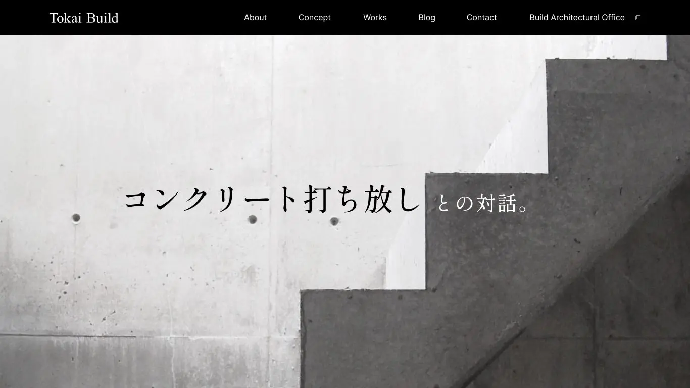
"Those who understand will get it." Tokai Build's website visualizes the sensibility of architecture.
We have redesigned the corporate website for Tokai Build Co., Ltd.
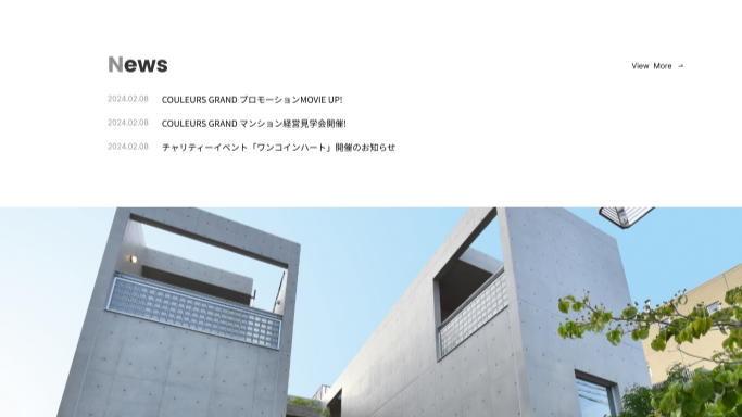
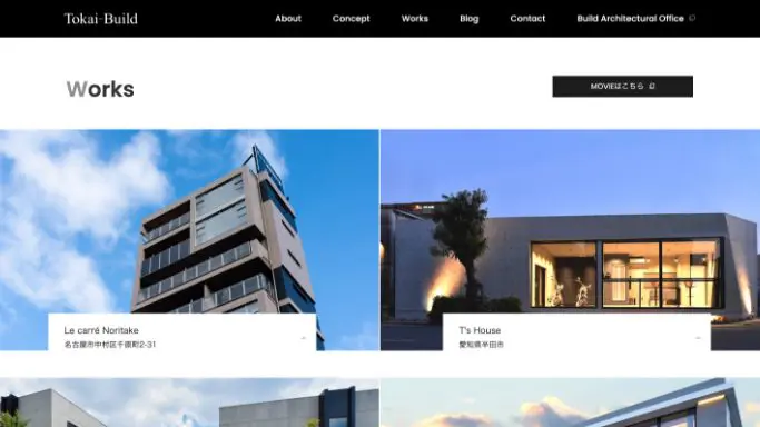
The main objective of this corporate website redesign was to visualize Tokai Build's worldview, with the aim of attracting inquiries from customers with a strong interest in architecture. Focusing on Tokai Build's strength and characteristic "exposed concrete," the website is structured to convey the appeal of their architectural achievements through a photo-centric visual approach.
Our target audience is people with a deep appreciation for architecture.
We deliberately avoided creating a site aimed at a mass audience, instead aiming for a site that "resonates with those who understand," giving it a quiet and dignified presence, much like a museum guide. We also chose to leave ample space for expression, without overwhelming the user with information, so that they can fully appreciate the architecture itself.
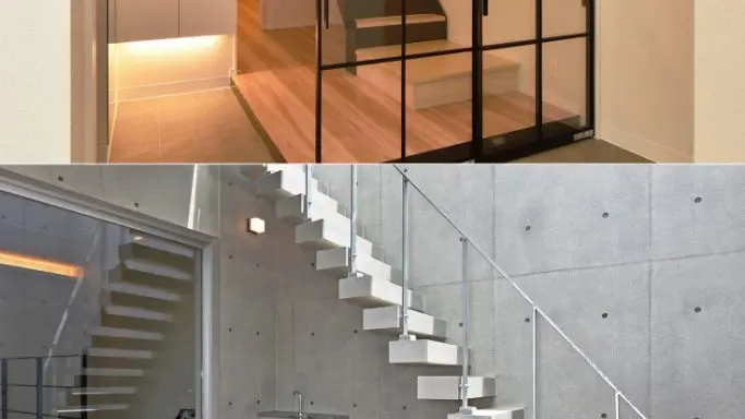
In terms of design, to allow viewers to fully appreciate the architecture, we minimized textual information and boldly placed photographs that fill the entire screen.
The site is designed to allow visitors to naturally explore it as if they were appreciating a work of art, creating an experience that touches upon the sensibilities of architecture.
Tokai Build's architecture embodies refined sensibilities and unique ideas.
The perspectives and knowledge accumulated through architectural training both domestically and internationally are evident in the details of the design, and each one is expressed as a unique touch that is characteristic of Tokai Build.
This website, too, is an extension of that philosophy and embodies the company's worldview.
Case Summary
Customer Name
Tokai Build Co., Ltd.
Project Details
Corporate website renewal
Production period
4 months
Case studies from the same industry
SAME INDUSTRY
# Construction industry
# Website
# Logo
# Branding
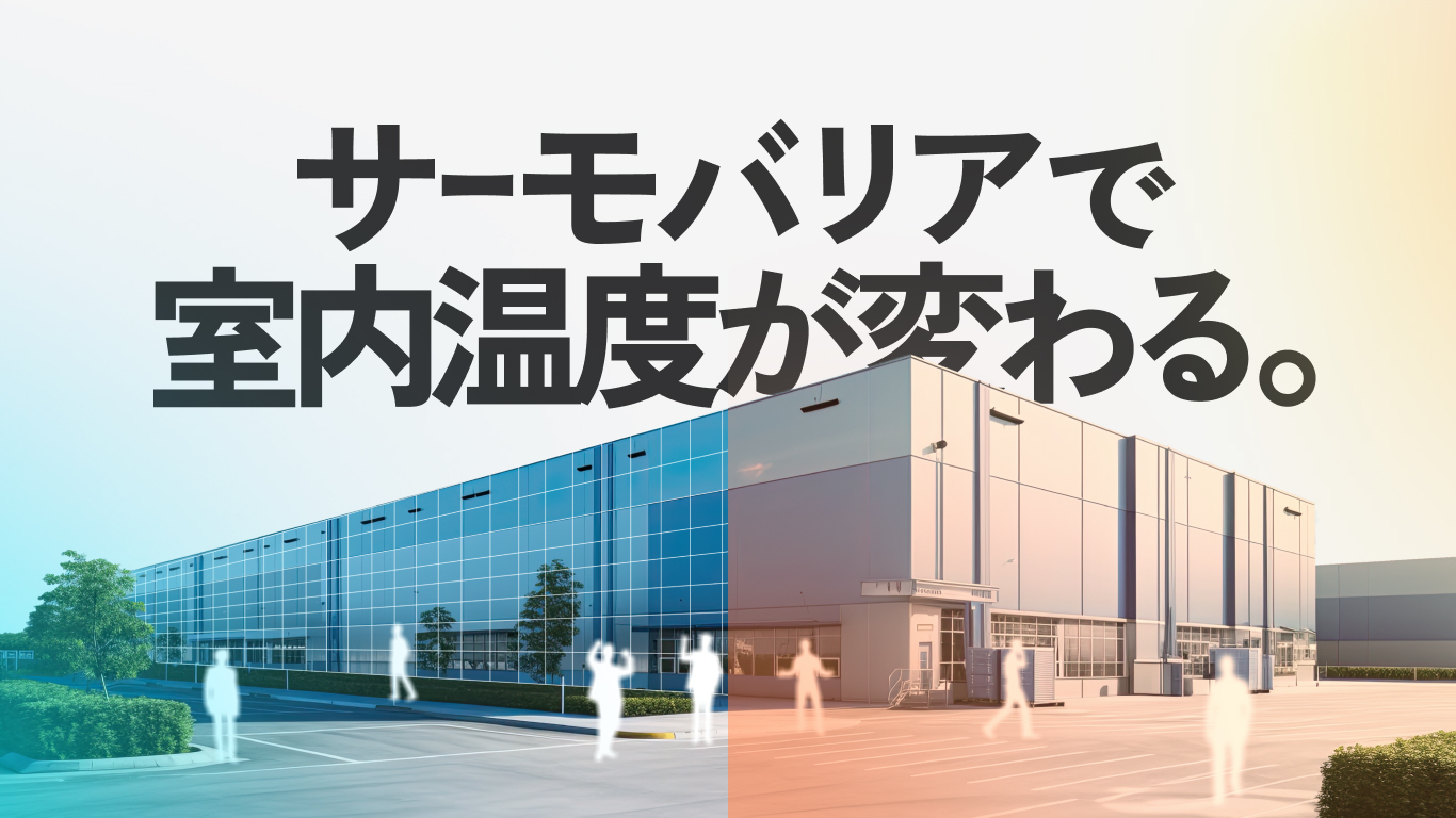
Entering the untapped heat-shielding market with "Thermo Barrier." A "talk script" type B2B website and total branding to maximize the sales capabilities of trading companies.
# Retail & E-commerce
# Construction industry
# Trading Company
# LH Method
# Website
# Graphics
# Logo
# Branding
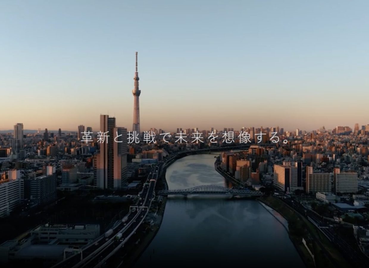
From the power of a single president to the power of the organization: A 10-year rebranding journey with TNS Co., Ltd.
# Construction industry
# LH Method
# Website
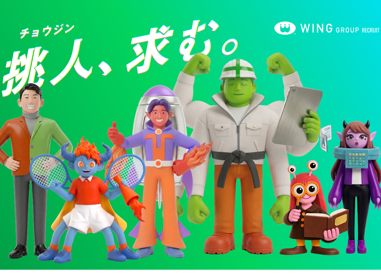
Hiramatsu Construction Co., Ltd. (Wing Group) – Case Study: Recruitment Website Development
Examples of the same production
Same Portfolio

# Retail & E-commerce
# Branding
# Marketing
# E-commerce Site
Railway reuse that connects "feelings." Breaking away from the volume and price competition of major companies, the promotional strategy for the original sticker "Guardian Deity Train" focuses on the nostalgia of people in their 40s and 50s.

# Service Industry
# Website
# Branding
From an atelier in Ichinomiya to the world: An online museum supporting 1,000 works by contemporary artists.
# Consulting
# Graphics
# Branding
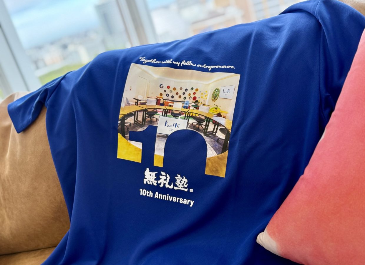
More eloquent than the letters "10th". A T-shirt commemorating the 10th anniversary of the Bureijuku school, embodying the "view from the round table" where our mentor sat for 10 years.
Support provided in this case
SERVICE
- Business domains Lionheart's powerful execution capabilities transform envisioned strategies into reality. Creators and engineers from Japan and abroad collaborate to provide optimal solutions for challenges, including web systems, AI application development, and design.
- Business domains We support companies in building brands that are chosen as "special" by their target audience. From articulating their philosophy to designing websites, videos, and spatial designs, we create a consistent brand experience.