


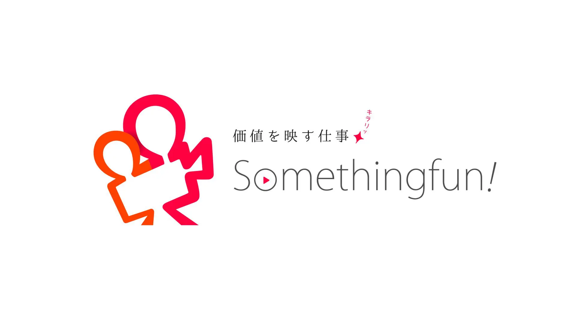
Going beyond the boundaries of a video production company. Logo design that conveys a company's values.
Something Fun is a company that falls into the category of a video production company, but what sets them apart from other companies in the same industry is that they find great value in "creating and expanding a market that utilizes video."
In other words, to put it bluntly, this company found value in contributing in some way to the revitalization of the "video utilization market," even if they didn't produce any videos themselves.
These unique values led to the creation of a new service that does not involve video production or editing, but instead provides guidance to client companies on video production and utilization.
However, at the time of the consultation, contrary to the president's wishes, the company's image, both inside and outside the company, had not yet broken free from the confines of being a video production company.
Therefore, for this project, we decided to design a logo that would serve as a "lighthouse" that shows Something Fun the direction they should be heading, and a "banner of unification" that would unite everyone's hearts.
As a fundamental function of the logo, we couldn't leave out the role of "making it easy to recognize that we are a company related to video production."
However, if the company ends up being perceived primarily as a video production company, it will retain its traditional image.
In other words, it means that we have not fulfilled our role as a "lighthouse" and "banner" guiding Something Fun towards the next stage they are challenging.
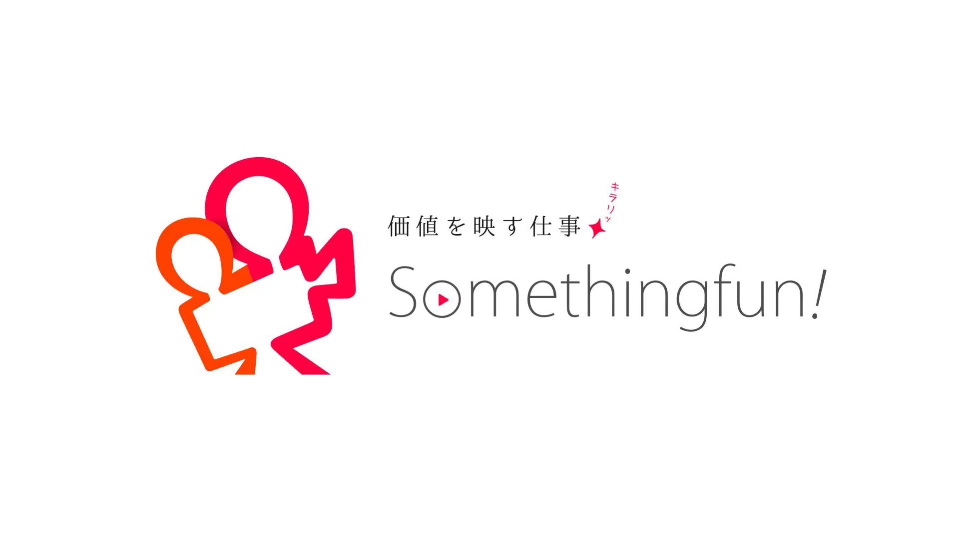
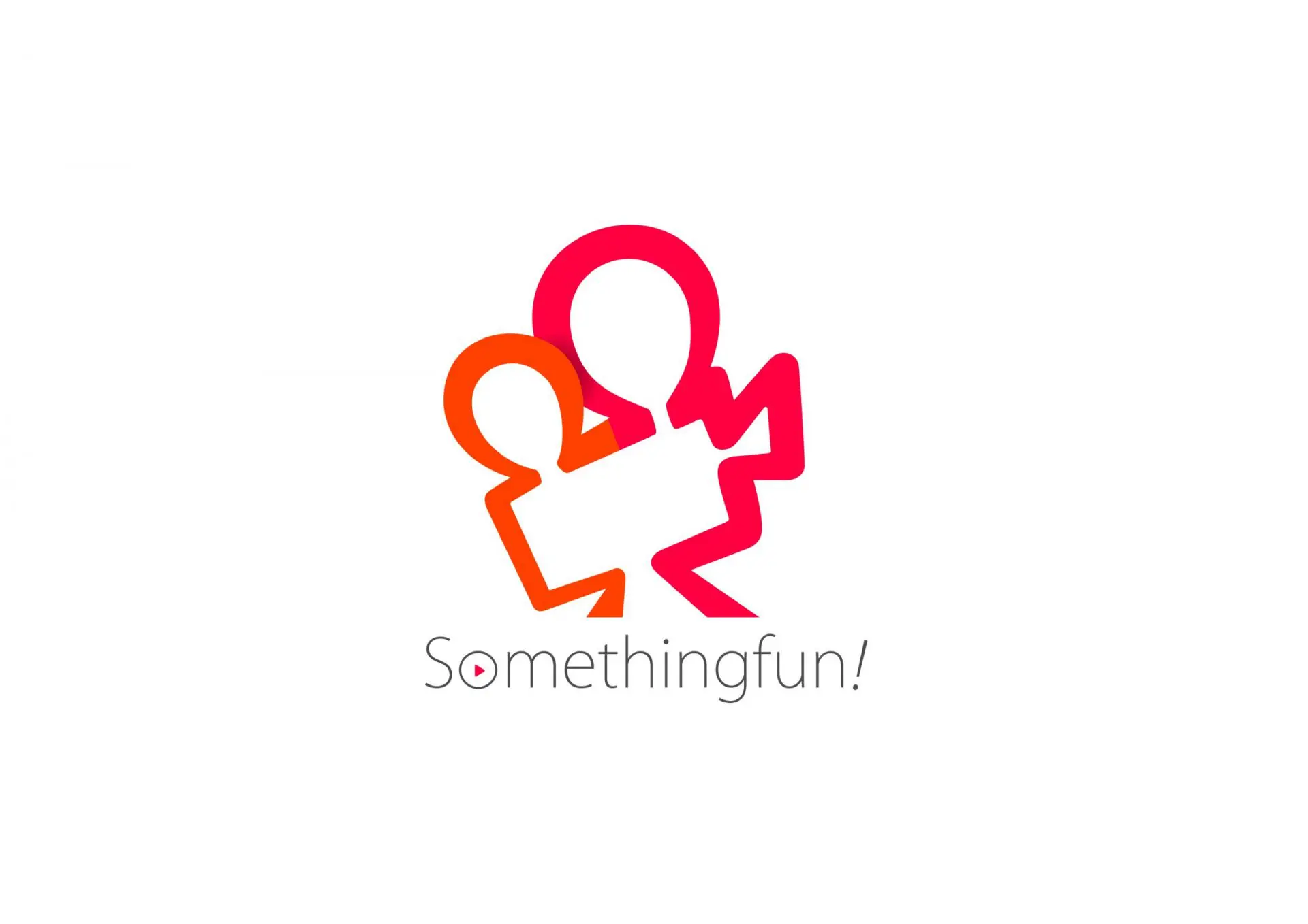
Therefore, we deformed items that evoke images (such as film cameras and playback buttons), simplified them to the point where they were still recognizable, and reconstructed them as symbols.
In addition, the shape of the logo incorporates the motif of a "person."
This is because video, by its very nature, only comes into existence and spreads because of "people"—those who create it, those who watch it, and those who share it. Conversely, I wanted to convey the breadth and potential of the video utilization market, as there are societies and markets that cannot expand without video.
As a result, a logo mark completely different from the previous one was created.
When companies communicate their intentions both internally and externally through such logo redesigns, it also provides customers with an opportunity to reconsider their own company.
Something Fun was no exception; we were able to clarify many things for them as well.
We are pleased to have been involved in Something Fun's new step by renewing their logo, and to have indirectly contributed to the revitalization of the video utilization market that they are creating.
Case Summary
Customer Name
Something Fun Co., Ltd.
Project Details
Logo design
Production period
3 months
Case studies from the same industry
SAME INDUSTRY
# Retail & E-commerce
# Service Industry
# Human Resources Services
# IT & Technology
# Logo
# Branding
Logo design for a company that connects Japan and Korea and creates new value.
# IT & Technology
# Graphics
# Logo
# Branding
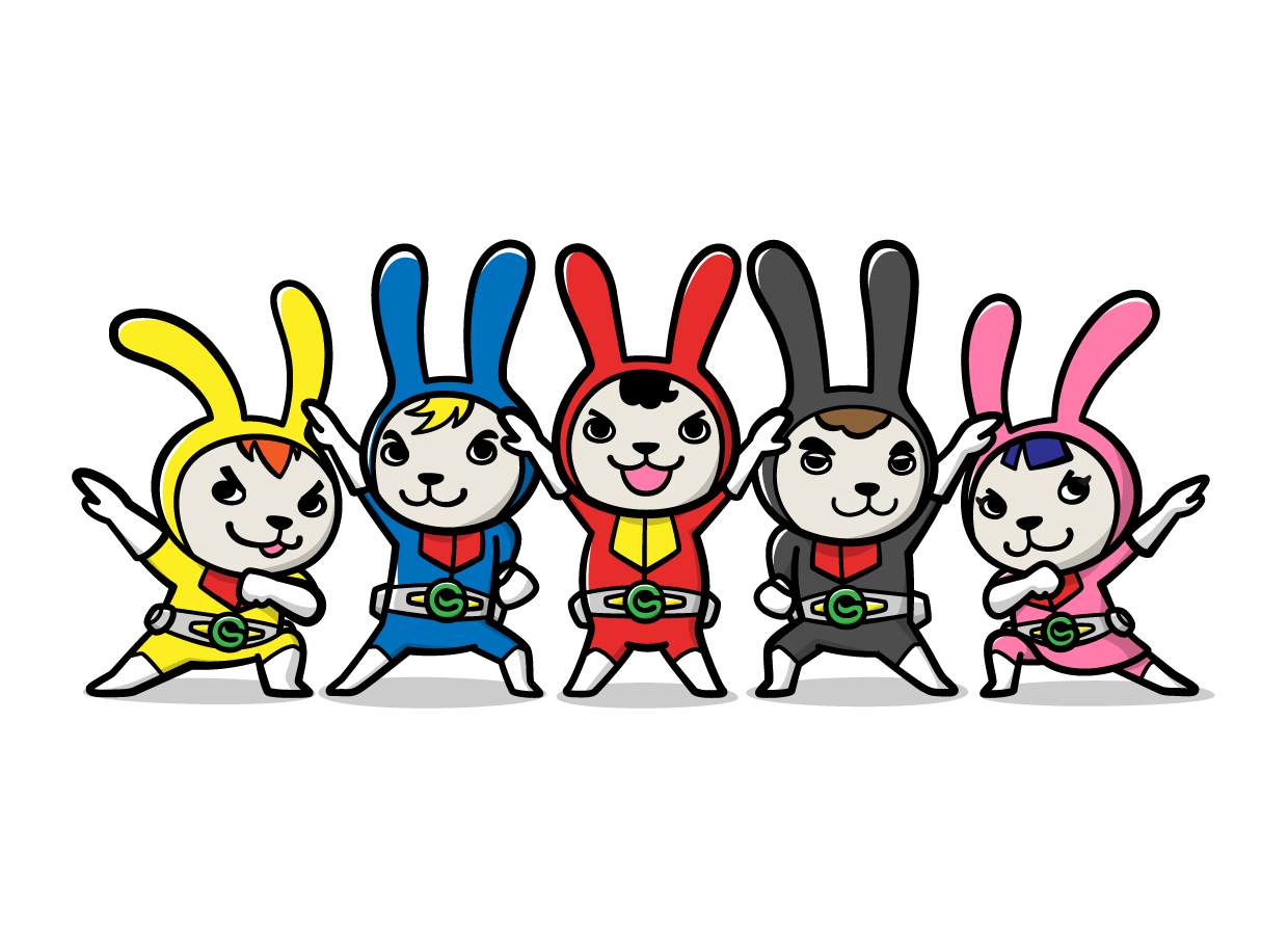
From a service character to a symbol of the corporate brand: Eight years of nurturing "Rabbit Chief"
# IT & Technology
# Manufacturing
# Website
# Branding
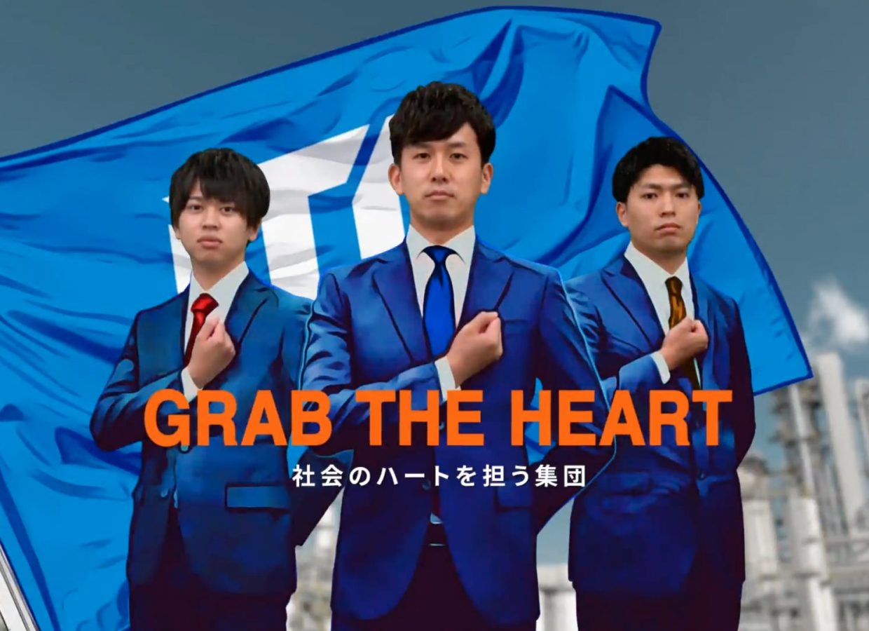
The video, featuring a beating heart and jumping motions, expresses the company's willingness to take on challenges.
Examples of the same production
Same Portfolio
# Beauty
# Logo
# LH Method
# Website
# Graphics
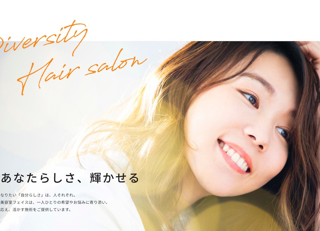
Making the future of hair salons more diverse. Total branding re-examined from the core philosophy.
# Manufacturing
# Website
# Branding
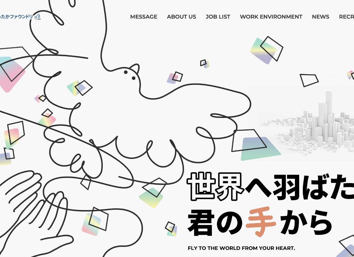
A fictional bird born from a "foundry." Web design that reflects the individuality of a company.
# Beauty
# Website
# Branding
"Colorful Workstyle" depicts the working styles of individual hairdressers.