


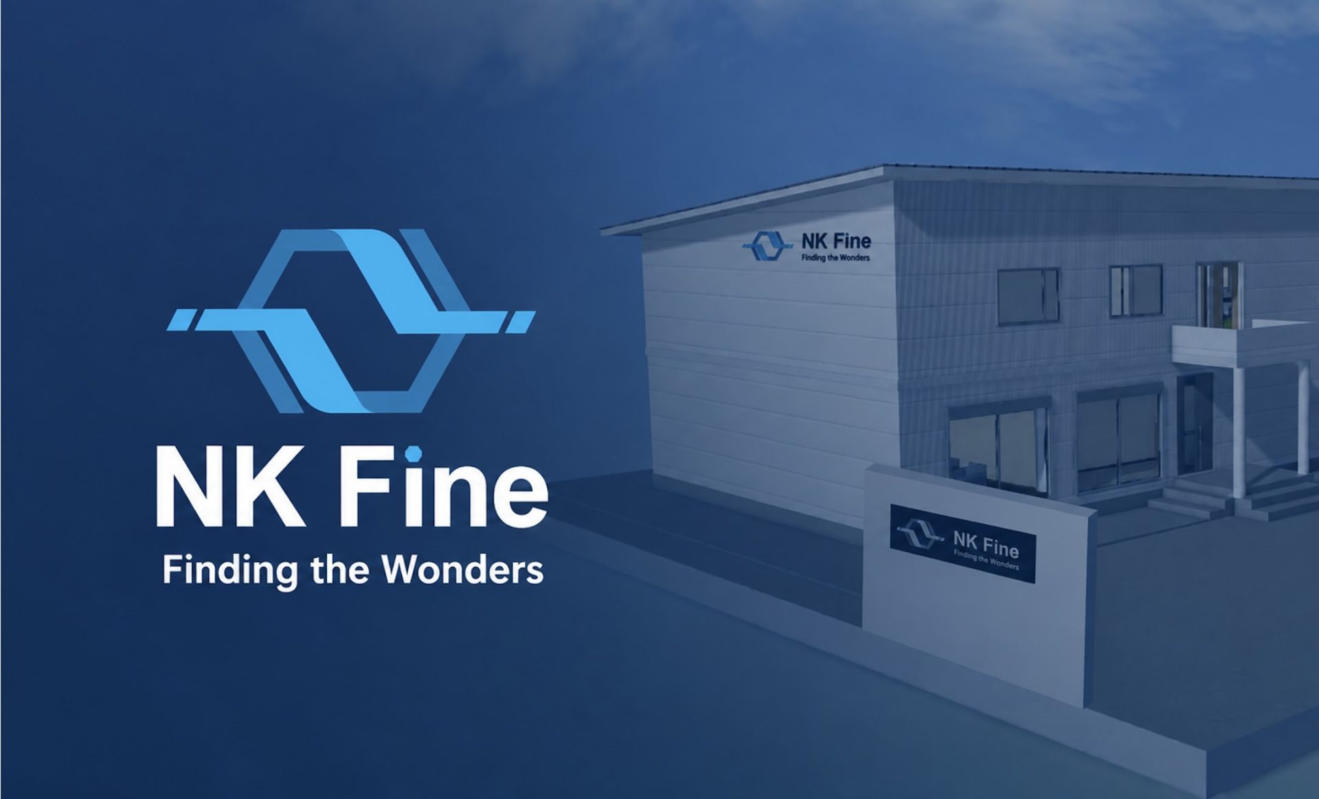
From a defensive manufacturing company to an offensive development company: A CI rebranding and logo design embodying the spirit and innovative spirit of the new company, NK Fine, in the "benzene ring."
Case Summary
Customer Name
NK Fine Co., Ltd. (Parent company: Nagoya Chemical Industry Co., Ltd.)
Project Details
CI/VI development for the establishment of the new company "NK Fine" (logo design, corporate tagline formulation, stationery and tool development, logo guideline creation)
Purpose
To articulate and visualize the proactive stance that the new company aims for, and to ensure that it functions as a solid brand identity in recruitment and sales activities for developing new markets.
Situation
In order to break away from the "defensive" image of the parent company, which specializes in polyimide manufacturing, and to establish a new company as a "proactive development proposal company," there was a lack of a symbol to represent this vision and approach both internally and externally.
Production period
About a month and a half
Flow of cases
STEP
01 Challenges (current situation)
Customer's challenge
Nagoya Chemical Industry Co., Ltd., a group company, is a long-established medium-sized company that started in the painting business and now primarily manufactures high value-added chemical products (liquids) called "polyimide." The company has the strength of being "a middle ground between a large manufacturer and a small company (taking the best of both worlds)," possessing the technical capabilities to flexibly respond to experimental manufacturing and the ability to handle a certain level of mass production.
However, the existing group company specializing in polyimide manufacturing was rather focused on a solid and conservative "defensive" system, which was to say the least, "strictly adhering to the rules." In contrast to this, the newly established company wasNKFine is an extremely challenging, proactive company that takes on the role of developing new chemical products and actively proposing and selling them to the market.
In order to operate and scale this "proactive company," we faced the following fundamental challenges:
■ Lack of essential vision and words: To develop new markets, it was essential to hire proactive individuals who could act independently. However, the desire to "become a company that proactively proposes ideas" had not yet been concretely articulated or codified, and a clear "philosophy" to show to staff and job candidates had not yet been established.
■ The absence of a "symbol" to show both inside and outside the company: Because there was no visual representation (logo) that embodied the new company's identity, there was a lack of a powerful sales tool to communicate "who we are and what kind of future we aim for" in external sales activities.
What was needed was not a superficial design that was simply "made and done," but the construction of a true symbol that embodied the soul of the new company and the course it should take.
02 LH Method Strategy Formulation (Ideal and Strategy)
Organize current status and challenges (Organize current status and challenges, and commit to realizing the vision)
Lionheart isNKTo bridge the gap between the ideal state that Fine aims for and the challenges it currently faces, we begin by delving into the words themselves, such as "What kind of ideal talent do we want to attract?" and "What kind of society should we present?"LHThe "method" has been applied.
The new company seeks "creative and proactive individuals" who can engage seriously with manufacturers' design engineers and procurement personnel and proactively create new value. To deeply resonate with individuals possessing this mindset, we have formulated the following brand concept and slogans.
[Formulating a tagline to guide the new company]
■ 「Finding the Invisible(Discovering hidden value)
(※Later, when the logo guidelines were established, they aimed to show further surprise and a challenge to the unknown.Finding the Wonders(Elevating the brand to this level)
This concept embodies a strong desire to "gather like-minded individuals who find joy in proactively discovering and developing latent needs that haven't yet been articulated in the market, as well as new chemical products that we haven't yet seen, and bringing them out into the world."
Building upon the strong foundation of "quality" and "reliability" that the parent company possesses, the strategic design direction was solidified here, focusing on how to visually translate the new company's goals of "proactively challenging the unknown" and "flexible thinking."
03 LH Solution Implementation Support (Resolution and Construction)
Solve the problem (Solve the problem with LH solution)
Based on the articulated concept, Lionheart proposed logo designs from multiple approaches and built solutions to solidify brand management.
■ Logo design creation (decision:Adraft)
We developed a design that highly integrates the solidity of a chemical and research and development company with the forward-thinking spirit to forge the future. • Symbol mark (fusion of benzene ring and the unknown):
The design incorporates motifs of the "benzene ring (hexagon)" and "molecular bond," which symbolize chemical structure.“quality”や“Reliability”While inheriting that solid foundation, we have created a design where the overlapping hexagons are broken down into overlapping "?" shapes. This represents "flexible thinking" that is not bound by existing common sense, and "discovering invisible value" from a multifaceted perspective in unknown areas.Finding the InvisibleThis beautifully abstracts the company's stance.
• Logotype (conveying speed and an aggressive attitude):
The font uses "italic" (slanted) style. This visually conveys a sense of forward movement and speed.“Aggressive R&D and sales company”asNKI tried to capture Fine's dynamic and energetic demeanor.
■ Stationery - Multifaceted visual presentation (mockup)
We designed and proposed a comprehensive mockup to ensure the logo was more than just a picture; it functioned effectively in real business scenarios.
- Signage deployment for the newly established lab and factory in Chiba: This involved verifying how the logo would be positioned on the entrances and walls of the new factory and cutting-edge development lab that were under construction in Chiba at the time. The signage design was created to be understated yet convey an intellectual, lab-like atmosphere.
• Business tools offered: business cards, envelopes (square)2・Long3) and various other stationery items. Furthermore, we provided designs for PowerPoint slide templates with beautifully placed logos for use in new business development and presentations.
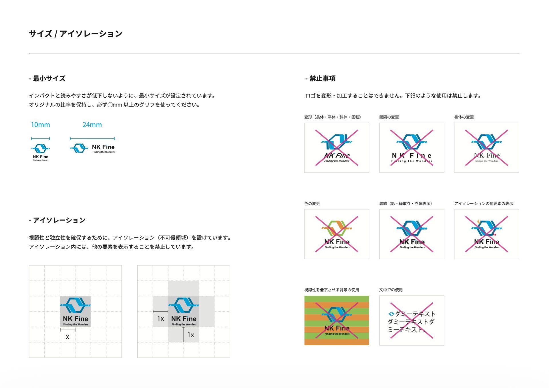
■ Establishment of logo guidelines (usage rules)
To maintain consistent brand control as a brand asset of the new company, we created "Logo Guidelines."
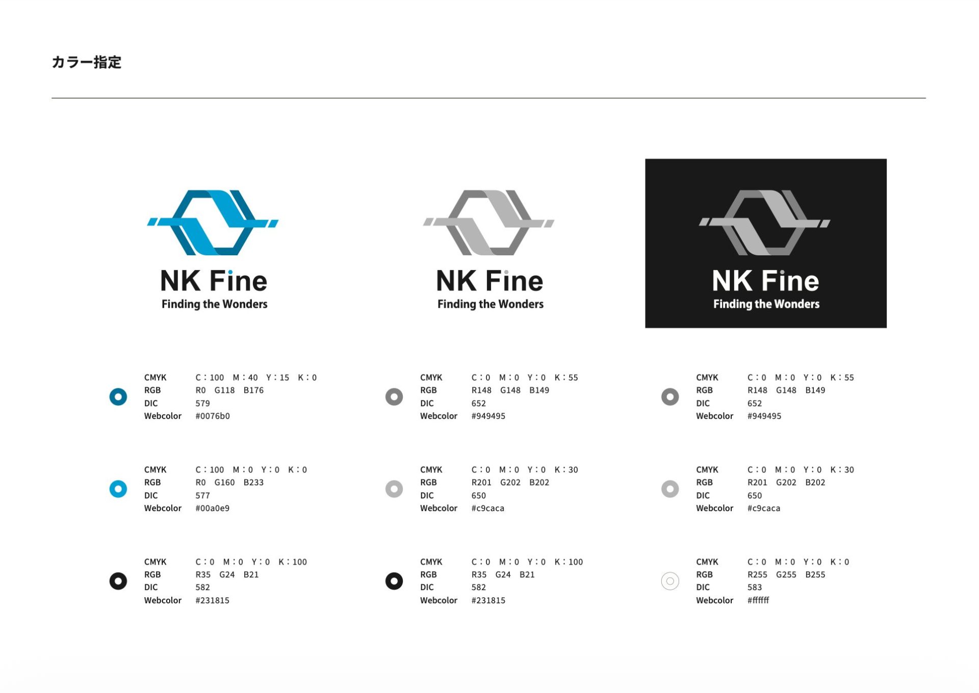
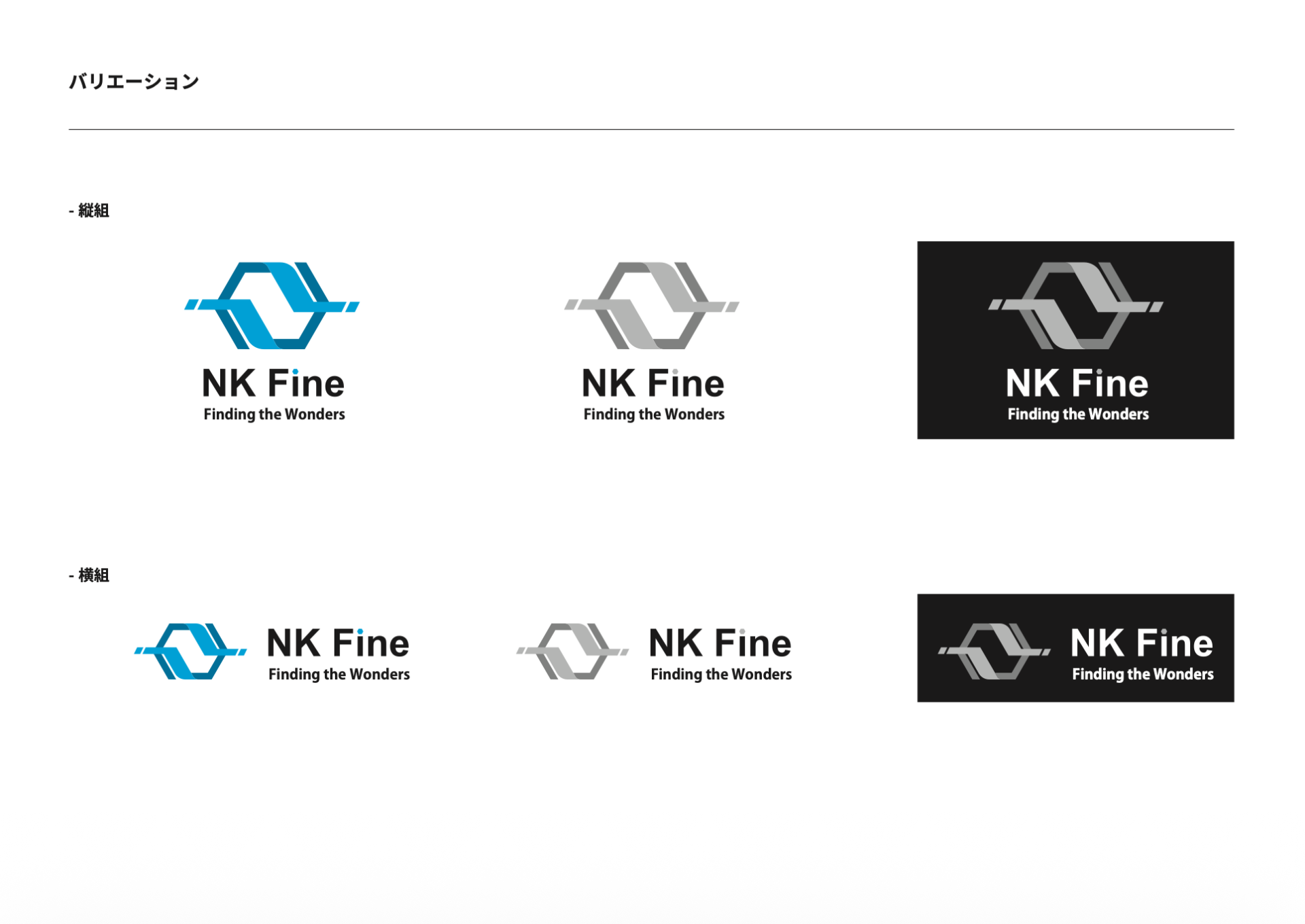
Color specification (CMYK、RGB、WebWe have meticulously documented everything from strict color regulations to the clear space that must be maintained around the text (isolation regulations), the readability patterns of the text to match the background color, and prohibited actions (such as deformation or color changes), creating a system that completely eliminates any inconsistencies in operation after delivery.
04 LH Method Implementation Support (Results and Support)
Continue to commit to achieving the vision (responding to changes in circumstances)
約1This project, which was completed in a short period of a month and a half, played a very important role as a "common language" during the startup phase of the new company.
■ Change and consensus building in the decision-making process
This project will not proceed solely based on President Okada's vision,NKThe person who will be in charge of Fine, or actuallyNKWe involved the members who will be running Fine on the ground and held numerous discussions.
In the process from the articulated method to the final logo design, all members of the team reached a consensus, resulting in more than just a "design change." It successfully fostered a shared understanding (engagement) beforehand of "what kind of vision we should have for this new company and how we should proactively take action."
Case studies from the same industry
SAME INDUSTRY
# Manufacturing
# Website
# Graphics
# Branding
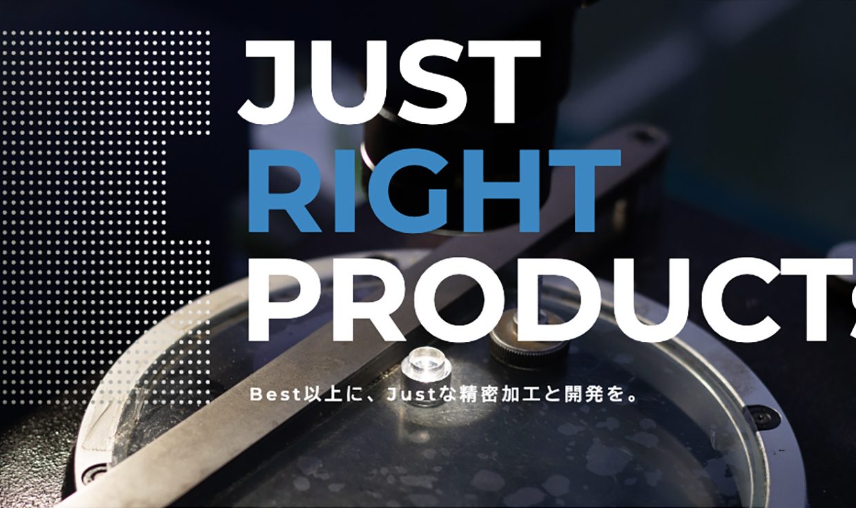
Transforming the changing automotive market into growth opportunities: Rebuilding the brand to connect sales, recruitment, and organization.
# Manufacturing
# Website
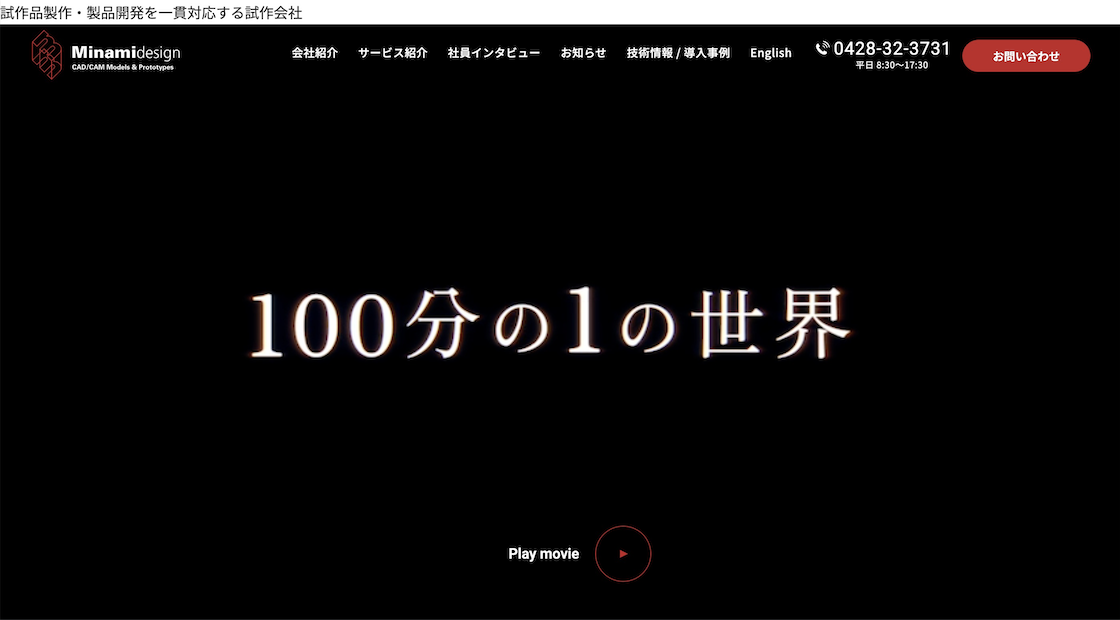
From a "prototype company" to a "co-creation development partner."
# Manufacturing
# Exhibition
# Branding
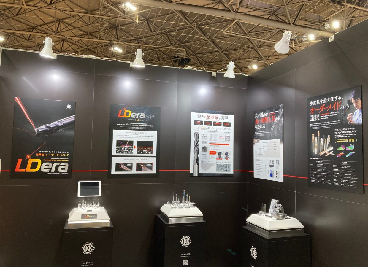
Making the world's first laser doping technology understandable.
Examples of the same production
Same Portfolio
# Construction industry
# Website
# Branding
# LH Method
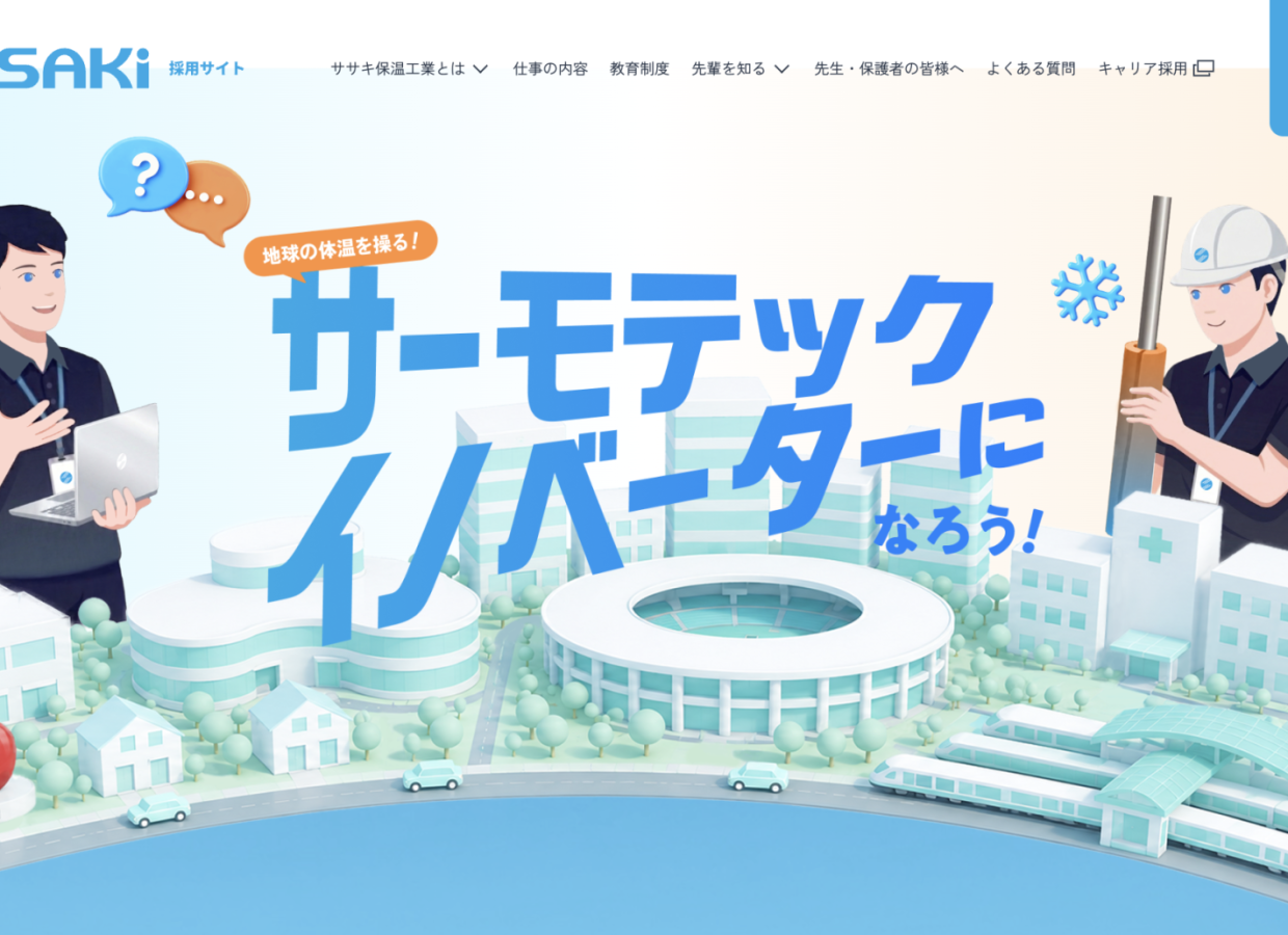
Challenging the conventional wisdom of the thermal insulation industry. Sasaki Thermal Insulation Industry's second-generation president takes on the challenge of innovation in "business and human resources."
# Service Industry
# Website
# Logo
# Branding
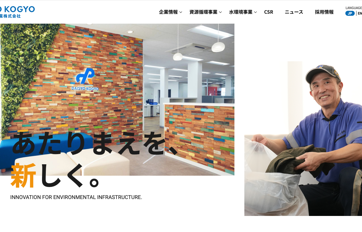
"Making the ordinary new." CI/VI rebranding for Daisho Kogyo, an environmental infrastructure company founded in 1965.
# Retail & E-commerce
# Branding
# Marketing
# E-commerce Site
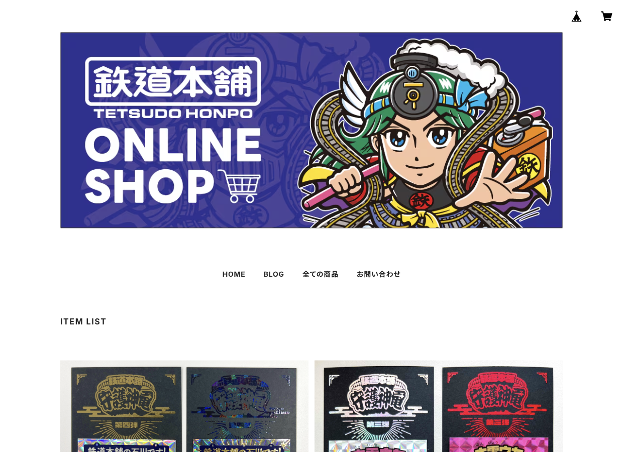
Railway reuse that connects "feelings." Breaking away from the volume and price competition of major companies, the promotional strategy for the original sticker "Guardian Deity Train" focuses on the nostalgia of people in their 40s and 50s.