


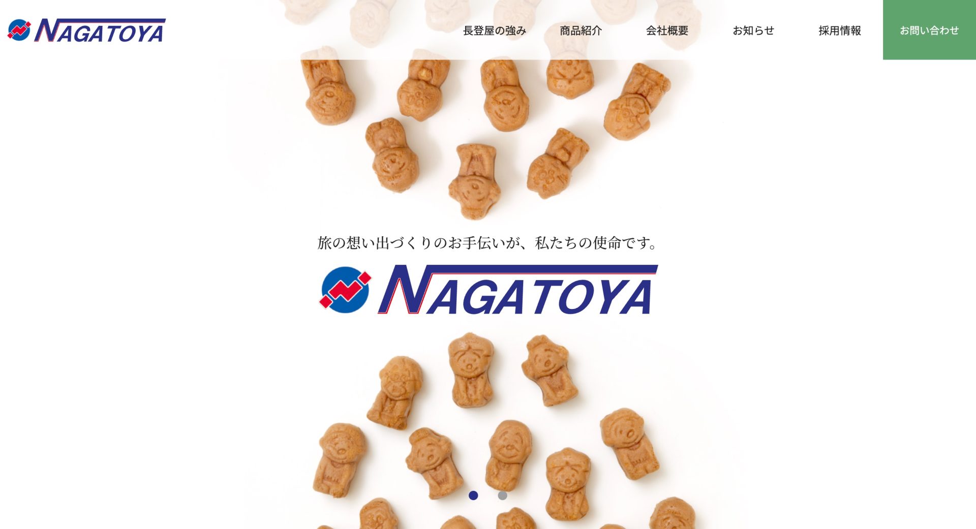
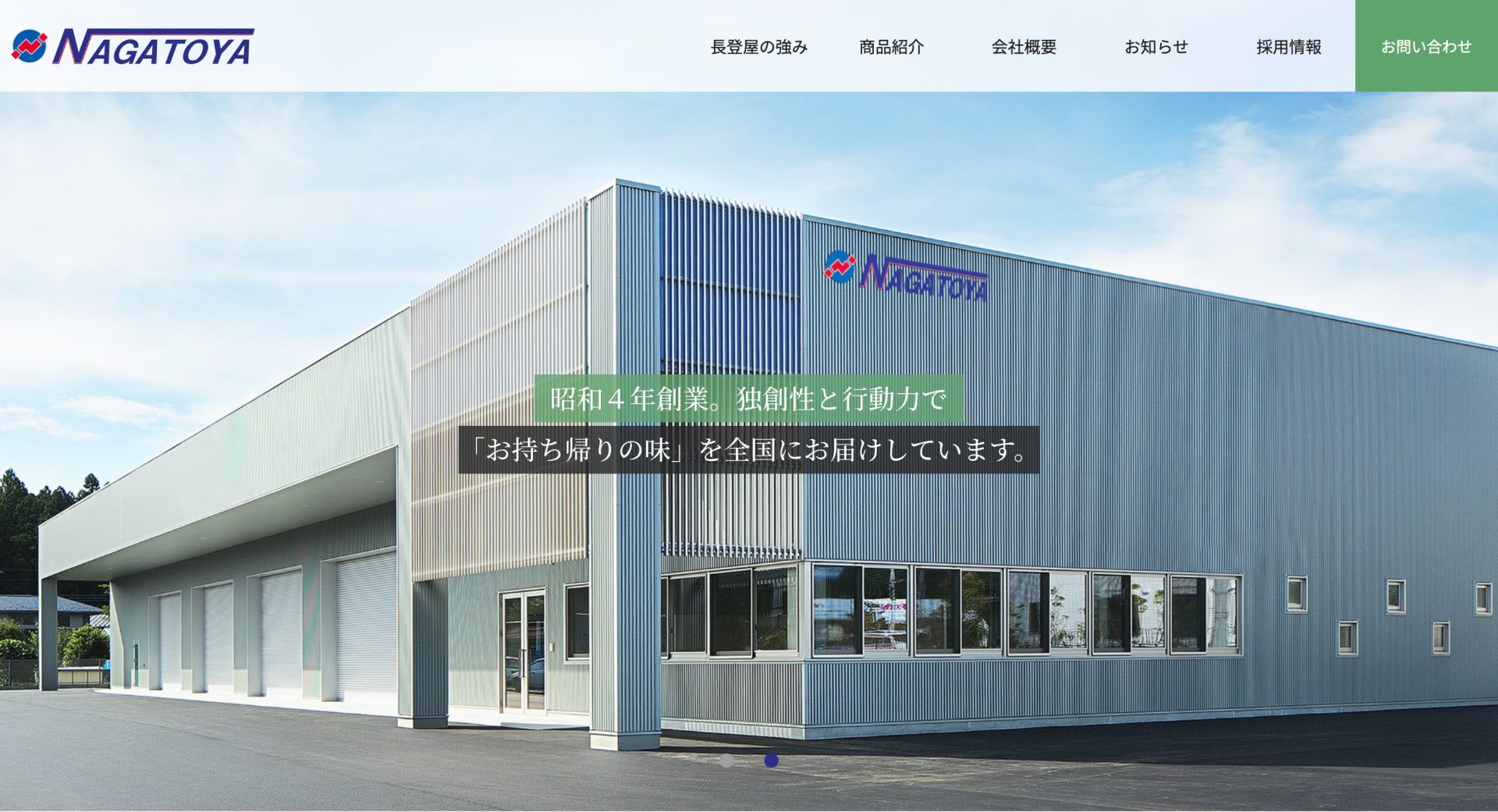
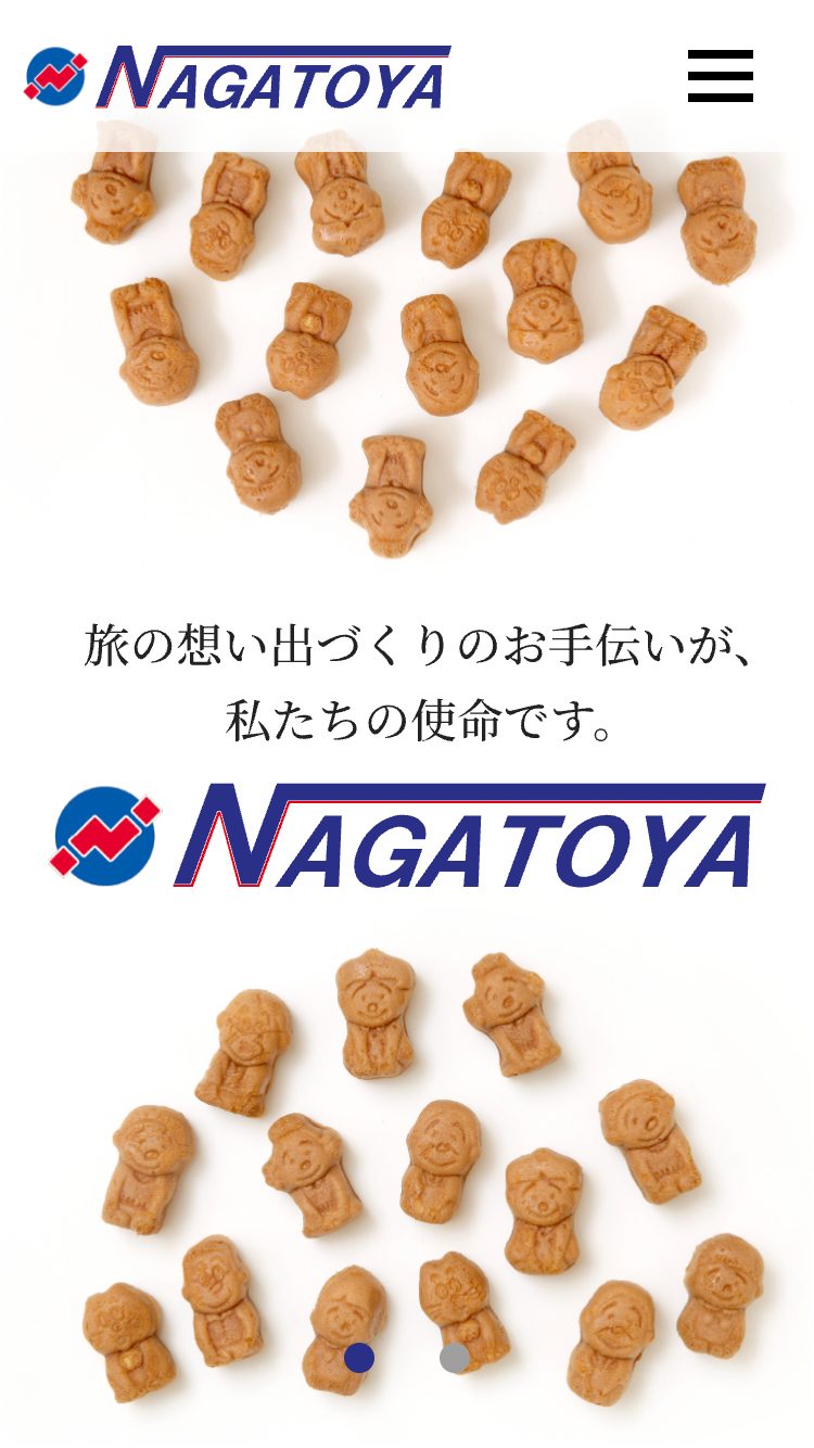
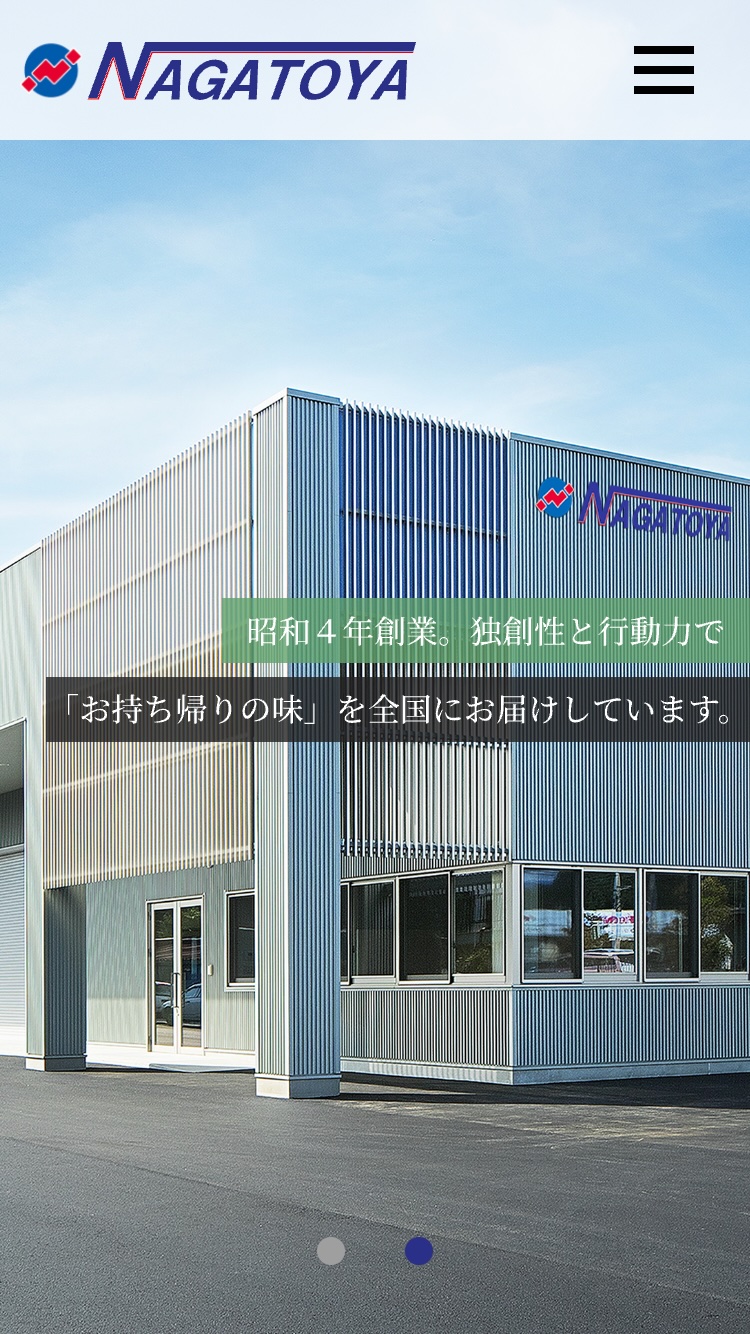
Maintaining a timeless, established brand identity: Website redesign for Nagatoya, celebrating its 90th anniversary.
Nagatoya is a long-established company specializing in the planning, manufacturing, and sales of confectionery, including souvenirs and gifts. They handle everything from planning, development, production, and delivery of character goods, OEM products, and novelty items. Nagatoya has bases and factories throughout Japan and also operates an online shop.
I worked on the project with the president's children, who are both directors and the head of the human resources department.
Although they felt the website was starting to look a bit dated since its last redesign a few years ago, they thought it was acceptable since it's a long-established company. However, as they approached their 90th anniversary, they wanted a redesign that would also be mobile-friendly. They wanted a design that was in line with the current times, but not something too groundbreaking. With the desire to convey a sense of history in mind, we aimed to create a dignified and refined look while retaining the key colors, color distribution, and overall worldview of the previous site, which was filled with the president's personal touches.
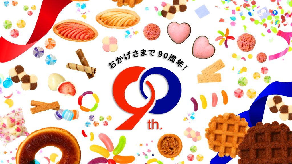
Regarding the 90th Anniversary, they were only promoting it by putting stickers on business cards and such, so we proposed using Nagatoya's products as a key design element.
Furthermore, during the project, the client expressed concerns that their current website lacked information highlighting their strengths and recruitment content. Therefore, we conducted numerous interviews and meetings to collaboratively create the content. For the photography, the product planning manager, who excels at creative work, played a crucial role, and we had a fun time creating the visuals together.
Case Summary
Customer Name
Nagatoya Co., Ltd.
Project Details
Website redesign
Production period
5 months
Case studies from the same industry
SAME INDUSTRY
# Manufacturing
# Website
# Branding
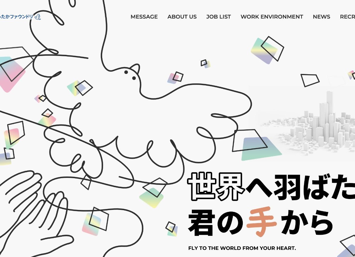
A fictional bird born from a "foundry." Web design that reflects the individuality of a company.
# Manufacturing
# Logo
# Branding
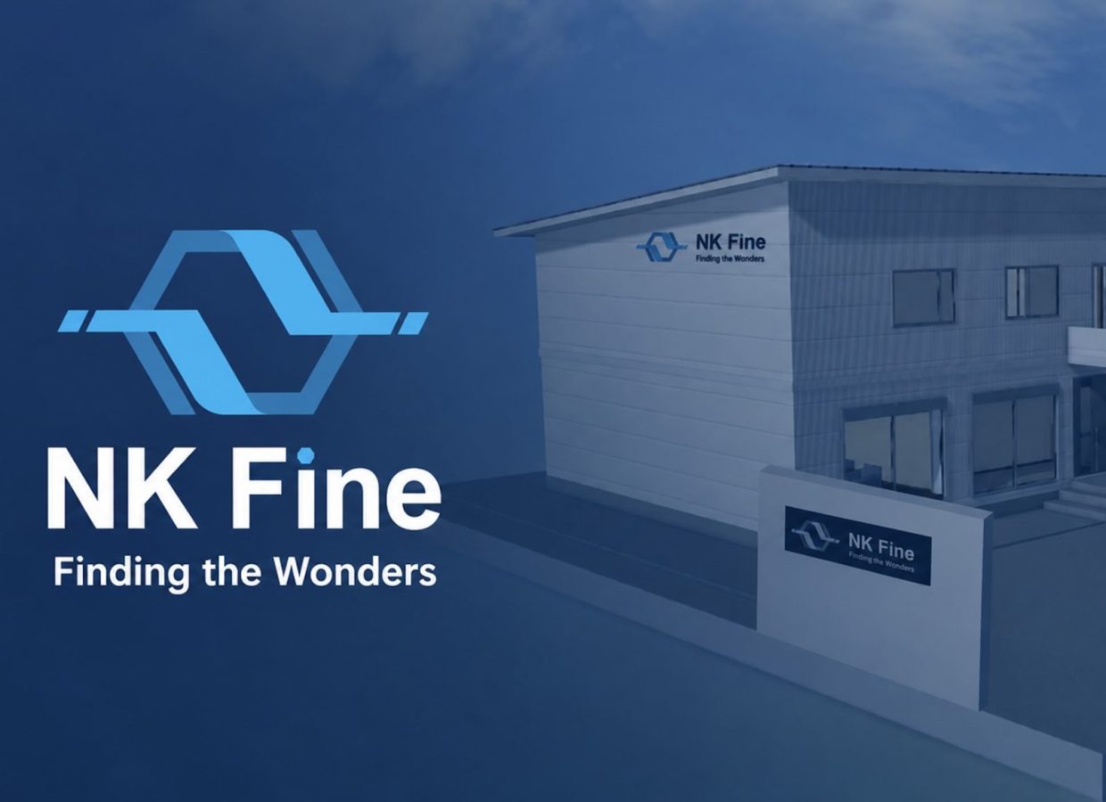
From a defensive manufacturing company to an offensive development company: A CI rebranding and logo design embodying the spirit and innovative spirit of the new company, NK Fine, in the "benzene ring."
# Manufacturing
# Website
# Graphics
# Branding
Transforming the changing automotive market into growth opportunities: Rebuilding the brand to connect sales, recruitment, and organization.
Examples of the same production
Same Portfolio
# Beauty
# LH Method
# Website
# Graphics
# Logo
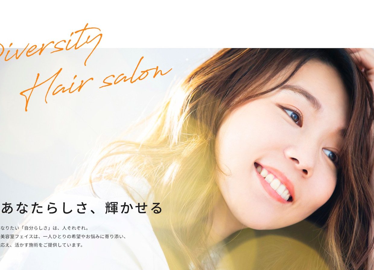
Making the future of hair salons more diverse. Total branding re-examined from the core philosophy.
# Manufacturing
# Website
# Branding
A fictional bird born from a "foundry." Web design that reflects the individuality of a company.
# Beauty
# Website
# Branding
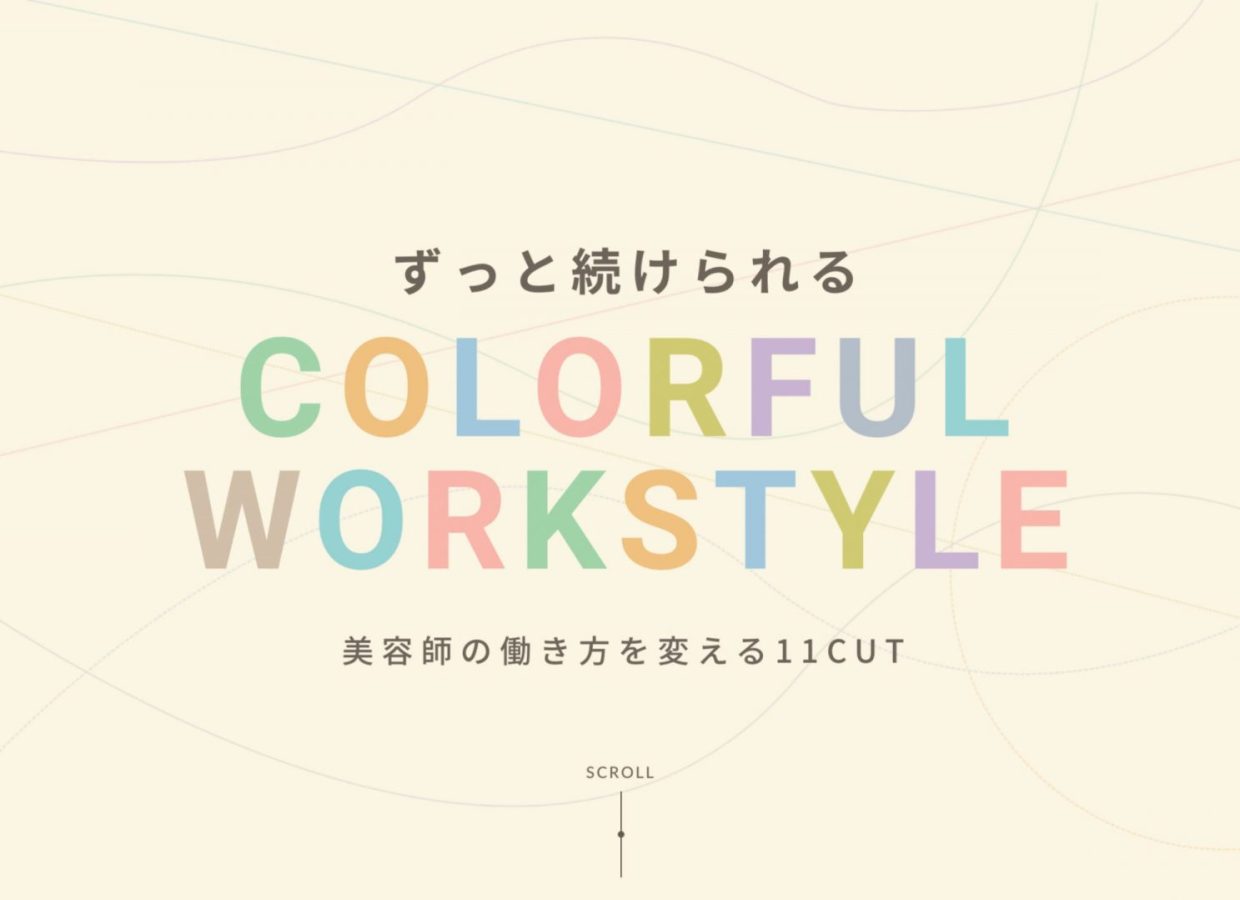
"Colorful Workstyle" depicts the working styles of individual hairdressers.
Support provided in this case
SERVICE
- Execution engine (creative system development, AI utilization) Lionheart's powerful execution capabilities transform envisioned strategies into reality. Creators and engineers from Japan and abroad collaborate to provide optimal solutions for challenges, including web systems, AI application development, and design.
- Branding support (corporate, recruitment, and office branding) Lionheart provides branding support. Based in Nagoya, we help companies across Japan and overseas create a consistent brand experience, from articulating their philosophy to designing websites, videos, and spatial designs, so that they are chosen as a "special presence" by their target audience.